


 Color isn’t just a simple design choice. It is a powerful tool that evokes emotion, impacts moods, changes perception, and influences decision making… and because of this, can be used to drive consumer behavior.
Most visible from a greater distance than other elements in your packaging design, color provides an immediate, foundational opportunity to attract customers.
 Consider the emotions and associations you want consumers to have when they interact with your brand, and choose colors that reflect those qualities. Warm hues like red, orange, and yellow can create a sense of energy, urgency, and excitement, while cooler blues, greens, and purples are often associated with calm, trust, and stability. Neutral colors like black, white, and gray can convey sophistication, simplicity, and elegance.
Visual Hierarchy

Typography is far more than an aesthetic choice that makes text readable and appealing—it’s a powerful tool for communication, consumer engagement, and brand differentiation. Thoughtfully structured typography helps organize information clearly on the package, allowing consumers to easily find essential details such as product name, dosage, ingredients, and usage instructions.
Through strategic use of font sizes, weights, and styles, line-spacing, and contrast—designers can establish a clear visual hierarchy that guides the eye from the most critical information to supporting details, enhancing user experience and understanding. On crowded dispensary shelves, typography can be a beacon for your brand. When your name and brand promise are being clearly communicated, shoppers can make a connection, even at a glance.
 Visual Interest
Though shape is often thought of as a forgone conclusion in packaging design, it can be a major player in consumer and brand perception. When market insight is applied to the overall shape of your packaging design, it becomes a powerful tool with emotional impact.
Unique and unexpected shapes are the first to get noticed in a sea of cylinders on a crowded shelf. The initial visual appeal of a package’s shape draws consumers in, and once your product is in their hands, the rest of your brand message has a direct line to their attention. If the rest of your design and functionality is consistent, delivering on the promise that drew them in, that shelf appeal will influence purchasing decisions and sales.
Value Statement
 When considering shape, material construction cannot be overlooked. By aligning your packaging materials with your mission, you deliver a strong and immediate message to your consumer—one that reinforces your values before a single word on your label is read. Whether it’s the use of sustainable materials, premium finishes, or tactile textures, your choice of material choices can quietly communicate who you are and what you stand for.
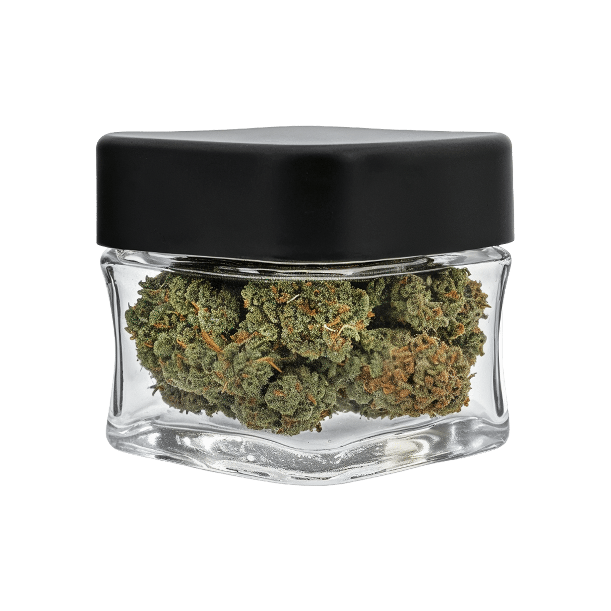
If sustainability is part of your brand identity, ensure that your packaging materials, inks, and adhesives are environmentally friendly. Kraft paper or uncoated cardboard suggests earthiness, simplicity, and natural purity. If you are working with a luxury brand aesthetic, a smooth matte box with embossed lettering has a level of sophistication that will appeal to a more prestigious market. Likewise, while a lightweight CR Mylar Bag has a casual, youthful, approachable nature, the smooth feel of a Glass Jar has clarity, and its weight underscores quality.
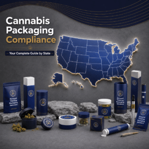
Discover a full range of custom cannabis solutions for your target market and the experience you want to deliver in our Product Catalog.
 Packaging has an auditory element that is often overlooked, but the sounds that come from a product’s packaging are not only part of the experience of that product, they play a powerful role in shaping consumer perception. This is especially true for cannabis products which must be stored in airtight, child-resistant containers and unlike a bar of soap that is unwrapped once and no longer retains its packaging, cannabis products are commonly accessed again and again over multiple uses.
In fact, with their CR mechanisms and air-tight seals for freshness, custom weed packaging offers many distinct sounds. With a popping sound that has become somewhat synonymous with security and freshness, the most common example of this is probably the PopTop Container. Ultimately, however, each form of cannabis custom packaging has an audible element during the unboxing experience that can evoke a sense of freshness, security, and even luxury. There is the subtle slide and snap of an elegant Pre-Roll Tin, the soft zipper closure of custom cannabis bags, or the super satisfying press-fit, pop-off click of Cocoon Jars, our very own innovative alternative to standard push-and-turn PET jars. Each of these sounds signal quality, care, and intention that begins a multisensory brand experience each time the product is handled.
A distinctive unboxing sound becomes a recognizable part of your product experience—offering the reassurance of safety and authenticity, while also signaling premium value. Intentional sound design in packaging isn’t just a detail—it’s a strategic asset that can deepen engagement. In the cannabis market where consumers are seeking products that feel both trustworthy and elevated, we can use auditory cues to reinforce brand identity and build emotional connection.